Key Points
One of Intruder’s core values is to make vulnerability management simple and visually engaging. So, when we decided to introduce a fourth plan to our pricing lineup, I took it as an opportunity to refresh our pricing page and add a playful twist that showcases who we are: a company that loves having fun, embraces feedback, and constantly iterates until we get things right.
Why Illustrations?
From the start, I knew we wanted something beyond the usual “list of features” approach. Illustrations can instantly convey a story. They also make a page more memorable. Since our overall brand identity had recently adopted a neon look, we saw an opportunity to push the boundaries even more.
Idea #1: Superheroes Evolving by Plan
Originally, I thought, “Why not represent our users as superheroes?” Each plan would have a superhero that increasingly levelled up: the more advanced the plan, the more advanced the hero. But initial feedback suggested that our users preferred seeing the villains we protect them from rather than themselves as heroes. That sparked a new approach.

Idea #2: Our Four Villains
Next, I created four villain characters:
- A home hacker (or “script kiddie”)
- A cunning phisher
- A “locksmith” hacker
- The ultimate “panda gangster,” referencing the fact that many cyber threat groups from China are nicknamed “panda"

It sounded perfect - evil characters for each level of threat. But the team’s reaction was that we should aim for something more reminiscent of classic game villains, to tie back to Intruder’s roots (our logo, “Greg,” is inspired by Space Invaders).

Idea #3: Game-Inspired “Gregomon” Evolutions
So, I pivoted. I took inspiration from classic 8-bit games and invented “Gregomon" (he was named by one of our amazing developers, Vic). Gregomon would evolve into bigger, scarier forms the higher the plan tier.

However, my sketches then drifted into a “Dragon Ball Z” territory, which was cool for some but didn’t quite match our brand’s overall tone. Again, I took in the feedback and kept iterating.


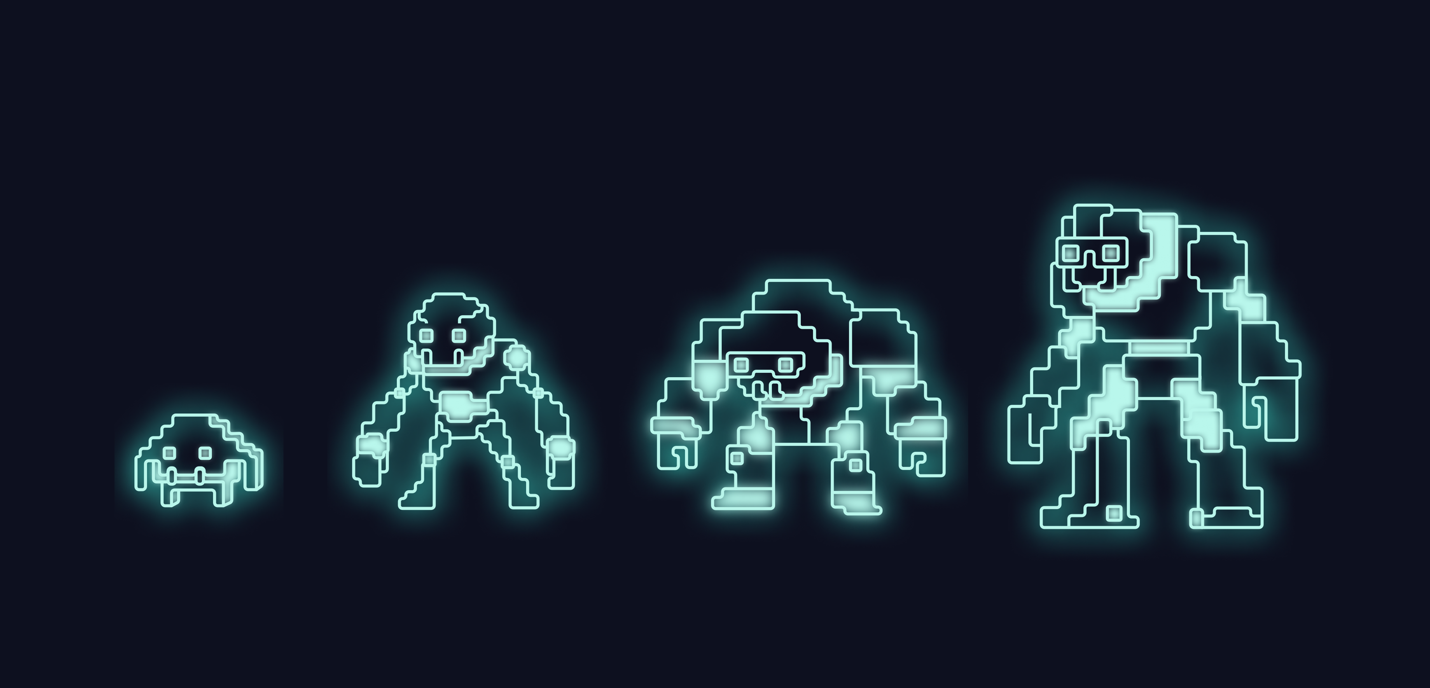
Idea #4: BioShock’s Big Daddy Vibes
I remembered the iconic “Big Daddy” character from the BioShock video game series (yes, that’s really its name, and BioShock is the game!). Its vibe - bulky suit, ominous feel - helped inspire a new set of villains that felt more in line with the menacing, sci-fi angle Intruder loves. Still maintaining Gregomon as the main shape, I did multiple sketches to capture three different evolutions - lower, mid, and high-level threats - each with an intimidating, techy style.

Because we recently switched more of our site to a neon-theme, I decided to place these characters on a dark background using very light blues, a color combination that contrasted well and reinforced our brand’s new look.


Embracing Pixel Possibilities
At this point, the team loved the direction. We were all excited by the fusion of retro gaming and neon vibes, so the next step was to see if adding a pixel-like style could enhance that classic, nostalgic feel. I set out to render these characters with pixel-based lines and details, hoping it would amplify the throwback look and make the illustrations really pop against our dark-neon backdrop.
Pixel vs. Vector: Final Decision
I tried a pixelated version to keep it old-school. But something about it didn’t click quite - it felt disconnected from the refined neon style we’d just introduced. One of my teammates, Dewi (Product Design Lead), suggested we forget the constraints and just embrace the more detailed, “rounded lines” approach, even if it wasn’t strictly pixel art. That advice was gold. By vectorizing these villains, we ended up with intricate characters that popped off the page and felt genuinely “Intruder”.

Living Our Values
What made this process truly special wasn’t just the final outcome - it was how we got there. Every round of sketches, every round of feedback reminded me why I love working here. We believe that the best idea wins, so we openly welcomed perspectives from all corners of Intruder. That led us to these fun, slightly rebellious villain designs that push beyond everyday design norms. We also know that it’s about the journey. We constantly reminded each other that the twists, turns, and playful experiments were just as important as the final illustrations themselves. Yes, we aim to build the best company in the world, but that doesn’t matter if we’re not enjoying each step we take.
This shared mindset meant that every comment, every Slack screenshot, and every tiny piece of critique shaped the evolution of our characters. No single ego dominated; it was all about pushing our ideas forward until something clicked for everyone.
Personally, I loved every “back to the drawing board” moment - each was an opportunity to explore new creative ground.
The End Result

Four pricing plans, each featuring its own menacing Gregomon-inspired character. A newly redesigned pricing page that’s cooler, more interesting, and strongly tied to our brand’s neon aesthetic.
At the end, it’s not just about standing out visually - it’s about embracing who we are and what we stand for. We’re a team that loves to have fun, appreciates genuine craftsmanship, and believes every person’s feedback can spark something great.
See the designs in action and stay tuned for more behind-the-scenes glimpses into Intruder’s ongoing design evolution! ✨

Nika is a Senior Product Designer at Intruder, where she brings a multidisciplinary background to cyber security. With roots in fine arts from Ljubljana and experience in illustration, she blends creativity with strategic design thinking. Her career spans both global corporations and agile startups, including extensive work with leading German automotive brands. She shifted her focus to cyber security, where she’s passionate about making complex systems feel intuitive and secure.


